Chess Set
THE UNTOLD STORY OF THE C.O.A.
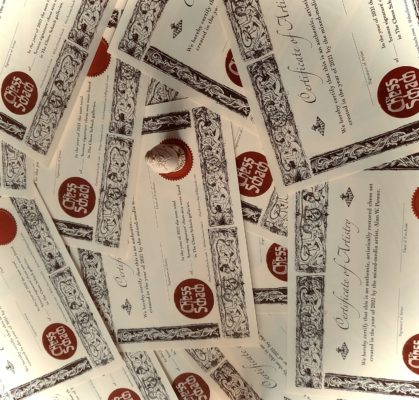
We are into the first few weeks of January and a busy day has been had signing, stamping, addressing, fluffing and stuffing envelopes with our fresh-off-the-press 2021 ‘bronze signature’ certificates of artistry. My wife Angie (the brains of the operation), kindly helps out with the latter part of this process, neatly addressing and organizing the envelopes while I dance the Latin names across the page and stamp the date of purchase, both of us making sure the correct certificate (or certificates) find their way into the correctly addressed envelope – which isn’t as straightforward as it seems, you know …
In the middle of this lengthy process, whilst admiring the sheer beauty of the CoA’s, Angie (a seasoned movie publicist who knows her stars) casually remarked, “So who are all these figures around the outside? The hairstyle of the woman looks quite modern. Is it supposed to be Anya Taylor-Joy?” “Spot on, my dearest Miss Marple!” exclaimed I (impressed yet puzzled all at once) “Isn’t it quite obvious though?” I asked. Angie’s expression, however, told me that it wasn’t quite as slap-in-your-face obvious as I thought, which got my old brain-cell a’wondering. Are the various subtleties that I peppered the certificate with too obscure? In my defence, the original artwork is almost twice the size of that on the certificate, so maybe some of the details have got lost in reduction, or are just a shade too subtle – in either case, it neatly provides a topical subject for 2022’s opening Chessay – the untold story of the certificate of artistry. Buckle up!
From its very conception I wanted the CoA to look traditional, but stand apart from the crowd. To look formal, but artistic … something that would engage the eye and draw the inquisitive viewer in. I love exploring chess history and have pored over many of the ancient books and manuscripts from The J.G.White Collection in Cleveland, luckily, only an hour away from Toronto. Many of the older works in the collection have elaborate woodcuts on the opening pages and a particular print sprang to mind from Questo Libro e da Imparare Giocare a Scachi et de le Partite (Rome 1512), one of the earliest ‘How-to’ books on playing chess, compiled by the Iberian chess tutor, Damiano da Odemira, known simply as the “portughese” in Italy. As an aside, it was Damiano’s book that the “famosso clerico” Rodrigo Lopez de Segura, heavily criticized in his more-famous treatise of 1561, without which we wouldn’t have a playful nickname for The Spanish Opening, or as it’s more casually referred to, The Ruy Lopez.
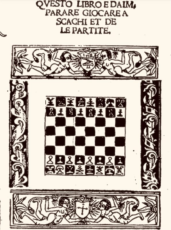
As I was saying, pictured above is the woodcut I remembered from Questo Libro (courtesy of the Cleveland Public Library). At first, my idea was to simply copy and paste the original border and margin images directly and use these for our CoA, but in practice this looked too crude, antiquated and detached. I loved the idea, but it would have to look a tad more sophisticated, chessified (if that’s a word?) and much more in tune with modern times, whilst still retaining a foot in the past, of course. Ultimately, I decided to redraw the whole shabang (not to be confused with a ‘shabangle’), which I first roughed out in pencil then followed up with black ink for the detailing. Like my artistically restored chess sets, I start out with a fairly good idea of what a project will look like on completion, but shift happens, if something tugs me in another direction I let the pieces/page have their say, too – and this is exactly what happened with the CoA’s. As I was mechanically replicating the expressions from Questo Libro the Renaissance nymphs started whispering to me … “I want to be a man” … “I want to be a queen” … “I want to be a chess-goddess!” – I was being tugged!
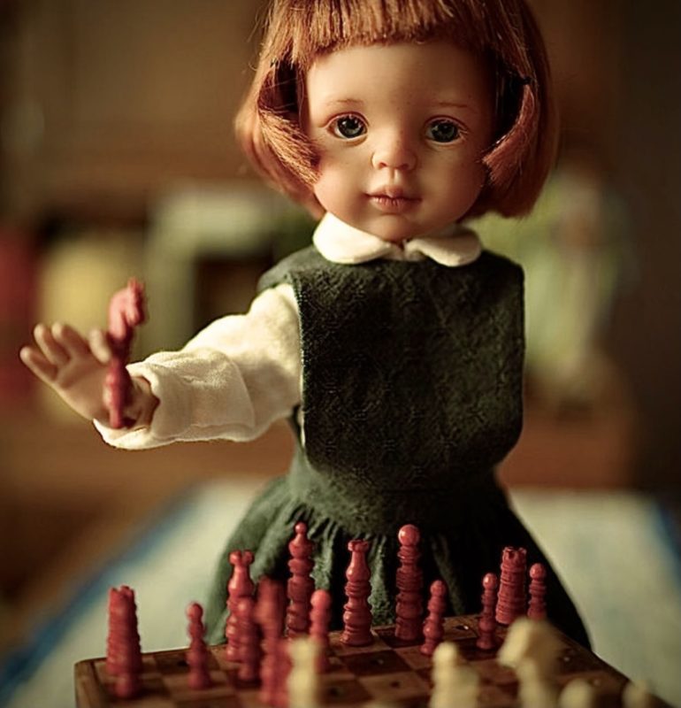
The shift started with Beth Harmon. I’d already completed her opponent, redrawing the image virtually unaltered from the early sixteenth century woodcut. When I moved onto the second nymph, however, I started playing with her hair and enlarging her eyes. At the time, Angie and I had just finished watching the superb Netflix series, The Queen’s Gambit, which premiered here in Canada in early November 2020. The ‘Gambit Fever’ had obviously rubbed off! As a quick glance at the signing off date (bottom right) confirms – Beth was still very much alive, whispering, Chucky-like, in my ear. The nymph soon became the chess-queen, Harmon. She asked for a strong male adversary, therefore, with permission, I added an artsy Italian moustache to the first image, beefed her up a little, changed her name from Giorgina to Giangiorgio and moved on to the subtleties that surround them. (See below)
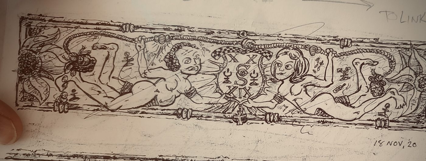
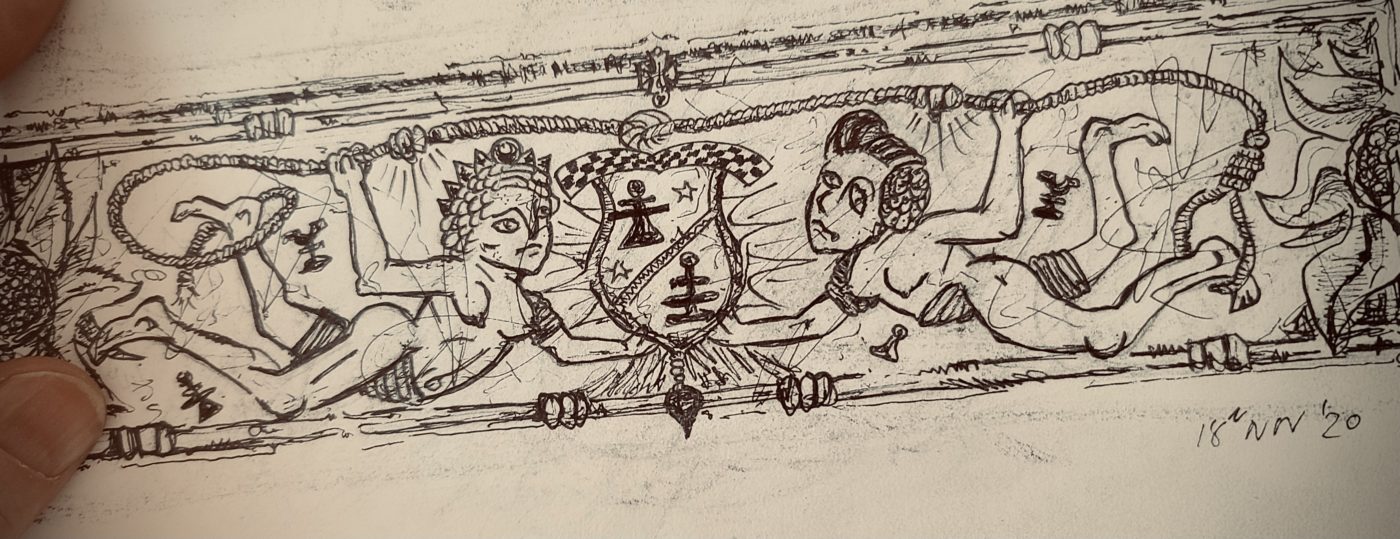
The two opponents are connected in two ways. Above them, as on the original woodcut is a rope with a wager of gold ducats at either end and between them are two different coats of arms. The rope signifies a struggle, a tug of war that can swing one way or the other, just like it does over the field of 64 squares. The shields in the woodcut most probably pay respect to Damiano’s patron, the Illustrious Signor Giangiorgio Cesarini (c.1460-1532), the Alfiere or standard-bearer of Rome, one of the highest military positions within the Papal Palace. The interlinked “IM” possibly refers to the Latin Idus Martiae (Ides of March), a not-so-subtle hint at the Cesarini clan’s shaky claim to be descendants of the great military tactician, General Julius Caesar, no less! In a similar fashion, paying our own respects to the origins of the certificate, Damiano’s patron, himself a “master of the military arts” is Beth Harmon’s worthy opponent.
If ye gracious reader observes closely, I usurped the Cesarini insignia and installed the Chess Schach coat of arms in its place using the same theme of the intertwined capitals C & S. The Roman numerals above and below represent 20 (XX) and 19 (XIX) marking the year we launched, and the two pawn images either side carry the ’Power’ symbol, a signature exclusive to our king’s felt bases and certificates of artistry. The central knot above the shield leans closer to the eventual victor; the glassy-eyed Beth is down material, as the hovering pieces taken from the array of Damiano’s opening page indicate, but as you can just make out, Beth has her pills and a ‘mickey’ (a miniature bottle of spirits) close at hand, which will tide her over in the endgame – she told me this…so let’s move on.
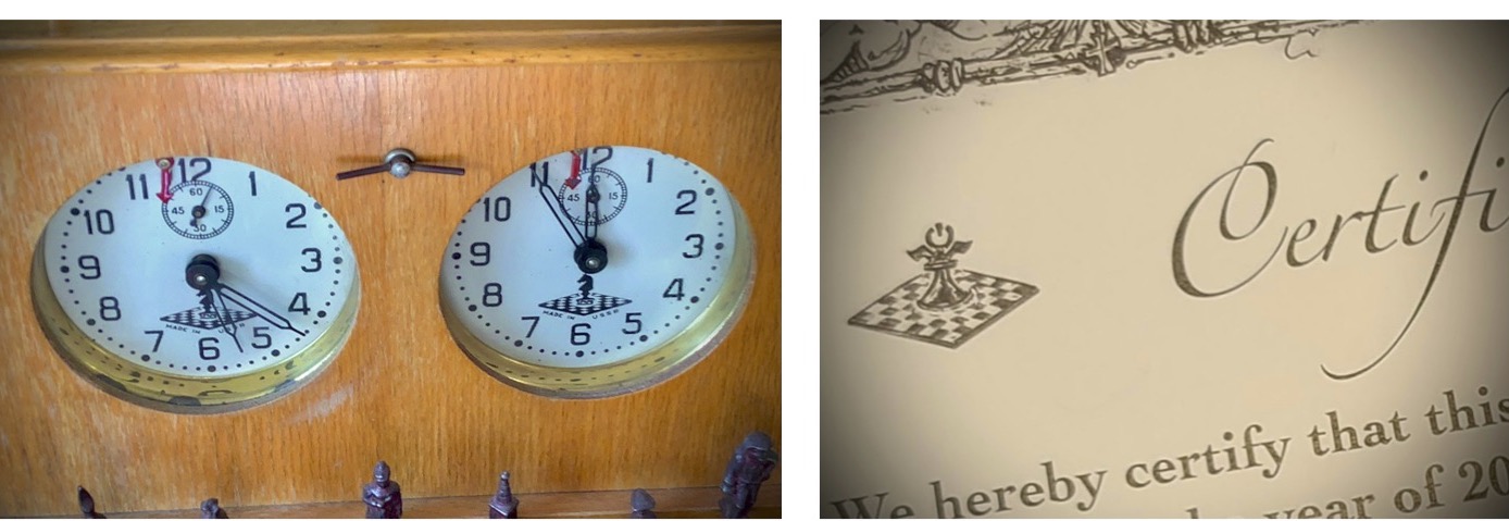
Actually, before we do, note the two mini boards with the aforementioned ‘power pawns’ either side of our fancy CoA header. The images may well seem familiar, as they are based on the iconic design of the old Soviet ‘Jantar’ tournament clocks (see below). The addition of wings refers to my continuing journey into the diverse and thoroughly engrossing world of Russian, Central Asian and Soviet chess sets – a well-known passion of mine.
With Damiano’s nymphs from the first panel having morphed into Giangeorgio and Beth I could now freely choose who would square up in the opposing panel. Of course, the first image could simply have been mirrored to complete the same desired effect of a double header and footer, but I shall only be designing one Chess Schach CoA in my lifetime, so by golly, thought I, it had better be a corker!
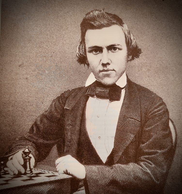
Quite honestly, my next two protagonists came to mind without even the glimmer of a thought – it was a no-brainer, as they say. The classic gambit games of the 1800s are my go-to when playing through old match-ups and the consummate chess artist of the era was the American apostle, Paul Morphy (1837-1884), without doubt, one of the greatest players to grace the annals of chess history (pic from Hartson’s Kings of Chess) and fortunately for me, from an artistic point of view, he had quite the hair-do, too, which Angie describes (yes, I had to ask for help on this one) as “a kind of cross between Justin Bieber and a 1920’s flapper” and honestly, I couldn’t have nailed that any better myself!
It seemed only fitting that Morphy’s female opponent should be a femme fatale, the seductive goddess of chess, the nymph Caissa, who enchants her lovers, often leading them into compromised positions and deadly traps. As you can see by the knot over the shield (below), she has an advantage, as the sorrowful expression of Morphy belies, for “the pride and sorrow of chess” has fallen for one of her tricks, losing his rook and queen, which hover tantalizingly in the air behind her. Also notice, ye gracious reader, that the young American’s heel is almost ensnared in a noose, a sign of his impending defeat and plight into madness, sadly leading to his early demise. The shield between them plainly indicates that the two gods were the king and queen of chess, one residing with the stars, the other an immortal mortal, signified once again with the primitive woodcuts of Damiano’s opening page from his treatise of 1512.
A few secrets remain, like the garters and armbands on all the figures, but what is life without a little mystery …
Until next time. Check you later!
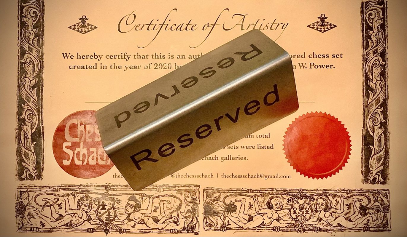
All rights reserved: Alan W. Power (The Chess Schach), January 2022