
Chess Set
A TALE OF TWO CAMPOS
THE JAILBIRD
They had seen the best of times. They had seen the worst of times. This is the tale of two Argentinian Campo sets that had fallen down on their luck; one spending many years in storage, the other an unkempt drifter, bumming from one collection to the next. And as you may have guessed, the former is the MacMillan Project (MMP) and the second the Rob Rankin Project (RRP) introduced in our March Chessay covering a brief history of this classic Olympico pattern. This follow-up, as promised, will loosely document the restoration of these two sets and may even inspire you, cherished reader, to revive a long-forgotten set from your own storage cupboard, too? Why not, indeed!
I say ‘loosely document’ because there are no fixed methods for this form of artistic restoration work as each set poses its own unique challenges. There are however certain tools, techniques and materials I constantly employ, my go-tos, if you like; and this is what I’ll be focusing on here as we have two very similar sets with some very similar issues; but as I’ve mentioned before, it’s the pieces themselves that tell us which path we should follow – and you have to listen to their whispers…

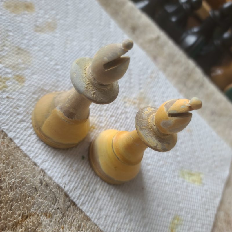
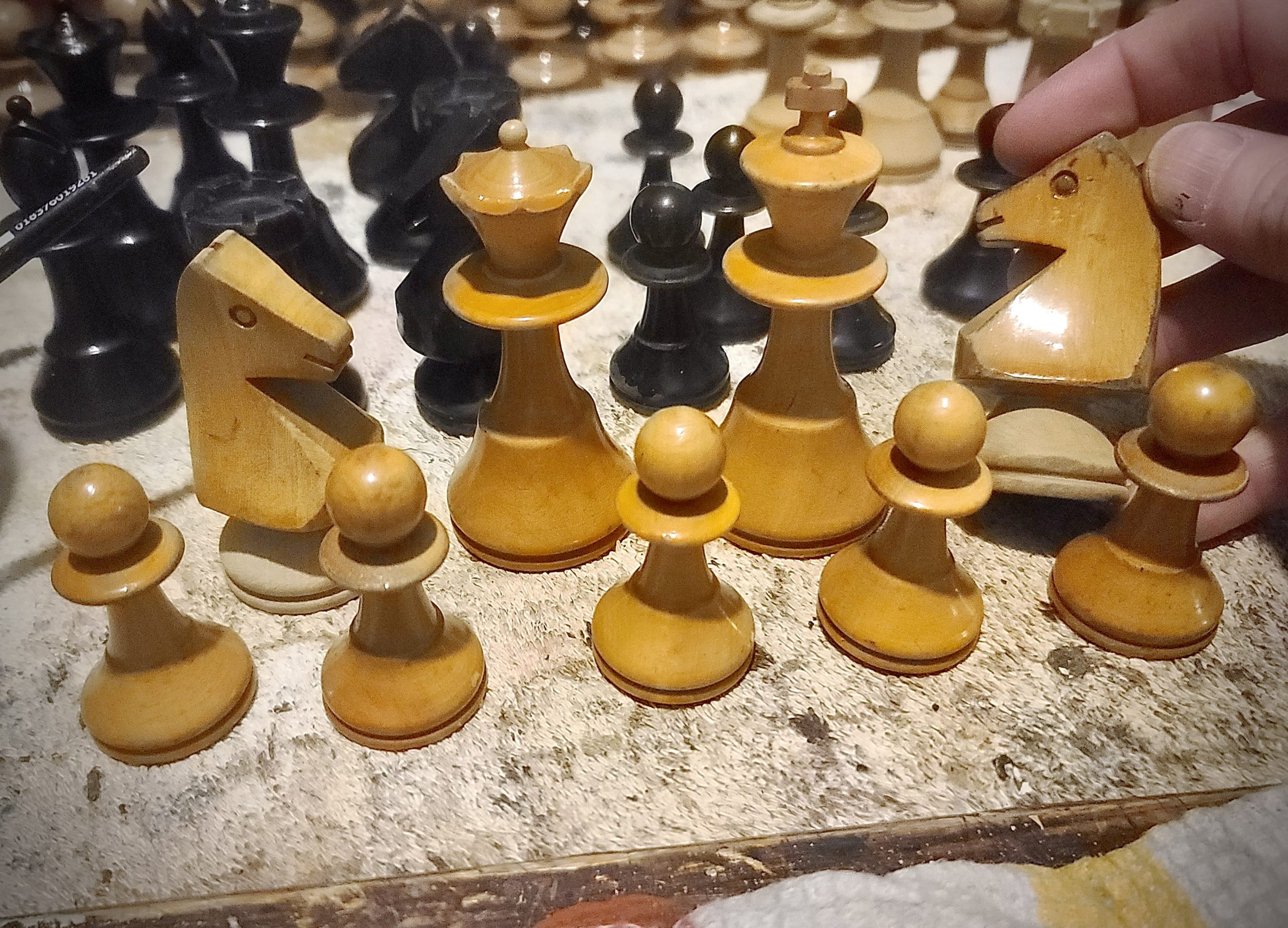
Let’s revisit the MMP then: (PIC 1, above) as noted by the owner, Robert MacMillan, the set is in “so-so condition” and we have various colour issues with the two hastily painted bishops standing out the most. I stripped these down first, as I was curious to hear what they had to say, and as expected the news wasn’t good. As you see, (PICS 2&3, below) I didn’t even bother disrobing them completely. The collar (left) has been repaired with a cheap cement-based filler, which has also been used on the other bishop to reattach its busted mitre. These Argentine pieces are not whispering to me, by the way, they’re hollering, “You can’t stain us, y’hijo de puta!” Which is rather rude, but true. They are telling me (in no uncertain terms) that they’ll have to be repainted, which affects the entire dynamics of the project as a whole.

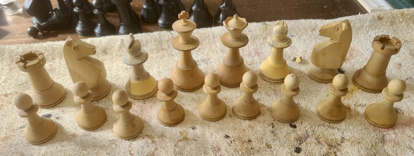
At the outset, my first instinct was to re-stain and age the Argy armies keeping true to their traditional colours but with a toned-down topcoat, as the client preferred low lustre to glossy pieces. Unfortunately, the battle-scarred bishops stuck a spanner in this idea as using a Minwax wood stain was now completely out of the question due to the high-viz damage. Even so, I was determined to stick with the original plan, therefore, the alternative way to go would involve a bespoke trompe l’oeil paint finish (from the French ‘to deceive the eye’), a deft faux-finishing technique that emulates the appearance of an aged wood patina, and after stripping the remaining pieces back to their birthday suits we were left with this motley array (PIC 4, below).
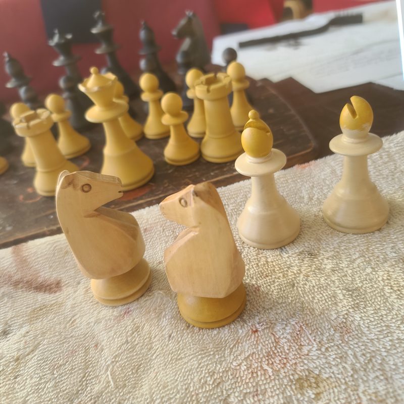
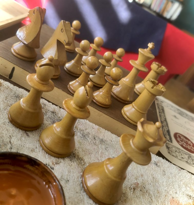
As so often happens, it’s during these opening stages of a project that the other pieces pipe up too; “Señor amigo artista” voiced a knight, “we are liking our aspecto natural. We peticion to keep this look, por favor?” And I couldn’t help but agree with this request, so I complied by sealing the raw wood with diluted Zinsser shellac (sprinkled with a few granules of Mr Cornwall’s fire-red pigment powder for badness) and the result looked very scorchio indeed. In fact, the two knights looked so hot (PIC 5, below) that I decided to use the very same approach with the dark pieces too – again, it’s the pieces that are telling me which path to follow – and it was at this stage that I could see the various steps needed to complete the project right the way through to the endgame – “mate in 12!” as the old grandmasters used to declare.
After the set was meticulously sanded down and dust-free, the first of these steps was to prime the pieces. For this, I used tinted satin latex paint and primer in one (PICS 6&7, below) thinned down with painter’s mate (water) to a loose but not runny consistency. Using this tinted primer/paint combo skips starting with stark white, which is best avoided, as we’ll be gently sanding each and every layer back and we don’t want to be seeing any white! Also, I’m using latex to start with as I can apply several coats per day, speeding up the whole process considerably. For these small projects, you can buy those ‘tester’ pots from Home Depot for around $6 a pop, more paint than you’ll ever need for one project.


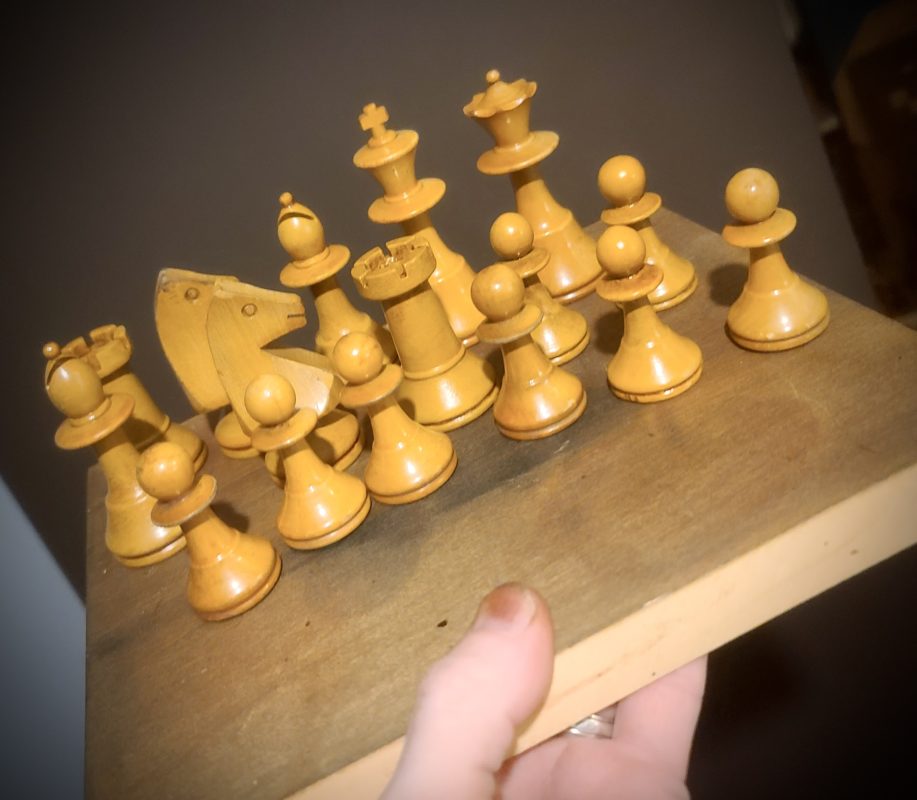
If we look back to Pic 5 you can see that all the pieces have been primed in a shade of Yellow Ochre providing a warm, earthy base colour. Now we need to aim towards the hues of the knight’s upper torso starting light (note the bishops), then edging darker as we apply layer upon layer until satisfied. As we progress there are some ugly little nicks and lathe marks that become more obvious once painted (PIC 8, below left), these can easily be repaired along the way with Minwax quick-dry wood-filler. After applying several thin layers I’ve arrived at my happy place, i.e. the perfect base colour with which to begin the next step. (PIC 9, below right)


As you can see, this should still be a shade or two lighter than the torsos, as the aging process will deepen this further. Before we do this, however, we need to seal the latex, otherwise the oil glazes we’ll be using will penetrate and ruin the water-based paint. For this I use a rock hard, oil-based satin sealer allowing the glaze coats to be gently sanded back without damaging our base coat. (PICS 10&11, below) Now it’s sealed we can see the set really coming to life. Very exciting! But there is still work to do – so let the arty-farty malarkey commence!


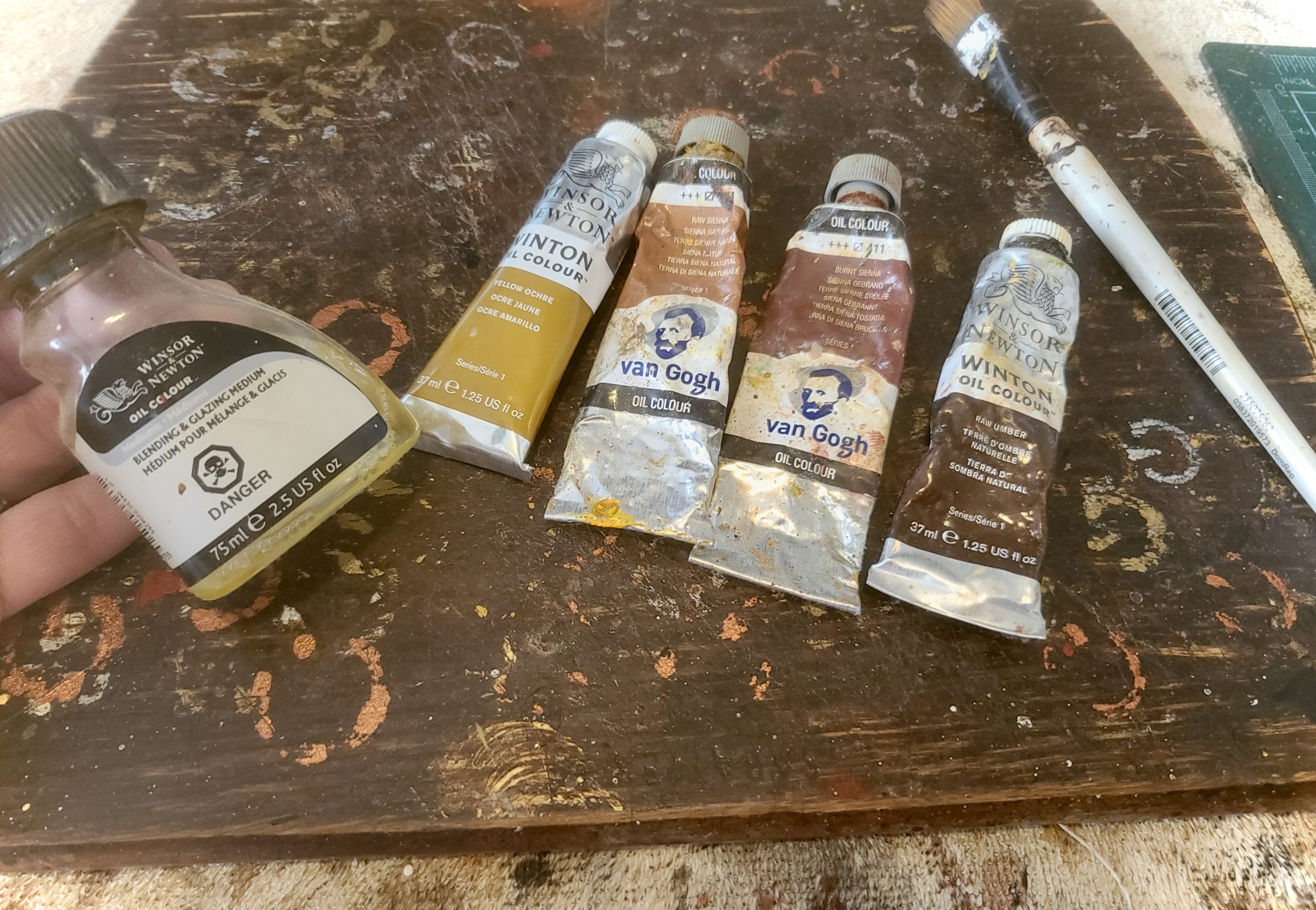
To imitate a subtle, wood grain finish a ‘dragging’ technique is employed using a relatively stiff brush, artists’ oils and a top-draw glazing/blending medium. To tint the medium, Titanium White and the four earthy colours shown here (in various combinations) are all you’re ever going to need (PIC 12, below), believe me. Starting from the collar down, I cover the entire area evenly in the thin glaze mixture (roughly 1 part paint to 10 parts medium) – a little goes a long way, so don’t go overboard when applying the glaze. Now, holding the piece between my thumb and middle finger, I slowly rotate it either clockwise or anti-clockwise using my index and ring fingers. This may take a bit of practice, but fortunately for me, as a seasoned saxophonist and picker of the 5-string banjo, this is mere child’s play!
But boasting aside; as the piece rotates, use a clean, flat brush (1/2” is ideal) and gently drag this horizontally across the surface with the bristles barely touching down but leaving behind faint, linear lines until the glaze starts ‘catching’ or tacking up. At this point, you should gently ‘tip off’ – lifting the brush away from the surface without leaving a trace.
This dragging technique creates tiny ridges that can be sanded back softly giving the illusion of a real wood grain. (PIC 13, below left) We can then repeat this process using either lighter or darker glazes with a thinner consistency (1/15pts), always knocking each coat back with super-fine steel wool until we have a satisfactorily solid, but organic finish. This is a lengthy process (with drying time), but well worth it. (PIC 14, below right)


What the hoo-ha?! Am I seeing double – treble even??? Not to worry. This was the point mentioned in the previous Chessay when I recalled the set Rob Rankin sent over from Oz. I didn’t colour-match to this king, but when I retrieved it from storage and put them side-by-side one couldn’t help but feel an overwhelming sense of ‘nailed the hijo de puta!’ All that remained now was to tone down the topcoat a tad and the MMP’s were as done as dinner, as they say (PICS 15&16, below) – so let’s move on to dessert! As now we have another ailing Campo set on the Chess Schach table, and whilst we’ll be using a similar palette and painting techniques, the RRP had ideas of its own – and I was more than happy to pick up what the old Argy was laying down, so to speak…


THE DRIFTER
Like our jailbird, the drifter has problems. Not too many problems, but familiar problems. For instance, the two bishops and three of the pawns have been painted that same ‘Argentine’ yellow we saw earlier; as had the rooks, and the turret of one had been strangely butchered (perhaps to differentiate the King’s Rook from the Queen’s Rook during the pre-algebraic era). These painted pieces were stripped down quick sharp revealing the usual suspects; decapitations, mismatched wood and a few ‘cement’ repairs (PICS 17,18&19, below). They didn’t have much to say for themselves as they knew their fate had already been decided.


Unlike our previous project, it was the remainder of the light army that convinced me which direction to take with the set as a whole. Their patina was drop-dead gorgeous! (PIC 20, below) It differed ever so slightly in tone, but there was nothing offensive to the eye. I could hear them screaming, “Don’t touch us, you gringo hijo de puta!” Again, rather rude, but I couldn’t agree more … the original patina was untouchable. Therefore, the rest of the pieces would just have to be matched as close as possible to the originals – and I could clearly see before me the numerous steps it would take to achieve this … like echoing footsteps in the snow.
As we know, repairs complete, the pieces now have to be primed using a similar latex/primer/water mixture as before. (PICS 21&22, below)


We’ll then apply the warm Yellow Ochre base coat (PICS 23&24, below).


We then move on to add more depth and shimmer by switching to a semi-translucent Yellow Ochre (left) lightened with a smidge of T.White (PICS 25&26, below) as we edge ever closer towards the colour of the knight’s torso. Again, we need to stay on the light side of the original patina as the oil glaze coats and varnish topcoats that follow will deepen the finish even further.


After the latex stage is complete and fully sealed it’s time for the oil-based glazing/ageing steps which add even more depth and softness. I need this to be of a slightly thicker consistency, enabling me to replicate ‘pooling’ effects where the original varnish coat had been slapped on carelessly and pooled or bled down. To achieve this, once the first pass is complete, I’ll darken the Ochre mix by adding a smidge of Raw Sienna plus a few drops of Minwax wood conditioner (PIC 27, below left), which serves as a thickening agent. All the labels tell you not to do this kind of thing – “do not use this as a medium” – but I’m an artist, not a psychic, so the gloves are off, as far as I’m concerned!


Here (PIC 28, above right) the two artistically restored pawns (front: middle and right) have had their first pass of the original glaze mix (while the remaining pawn and the other pieces patiently await their turn), and as you can see, we are heading in the right direction. Once dry, I’ll hit them again with the same blend but heavier, leaving some ‘pooling’ using the original pieces as a guide. For the final pass, a darker mixture is prepared by adding a smidge of Burnt Sienna (PIC 29, below).
I’ll just be playing around with this, hitting the nooks and crannies and adding depth to the collars. As mentioned at the outset, this isn’t meant to be a strict ‘How-To” Chessay, but more of an inspirational insight into the methods and materials I use to achieve certain effects. A book and accompanying instructional CD (PICS 30&31, below) are in the pipes for 2023 covering (with eye-watering clarity) my staining, aging, painting and antiquing techniques plus some minor restoration tips, too, but more on that bundle of fun in due course!


At this point, I’m more than happy with the colour-matching process, the result of which is a uniform array that looks like it’s been around for a decade or four (PIC 32, below left). The final hurdle is to match the sheen of the newly restored pieces to the original patina. The patina varied ever so slightly between pieces making my job a lot easier as I’d just aim for the middle ground and play around. For this, I blend two types of Winsor & Newton varnish, matte and high gloss, (PIC 33, below right) enabling me to hit any sheen I wish by adding more of one and less of the other.


A good idea is to mix 4 or 5 different recipes, let them dry thoroughly and pick the winner – and in this case, I ended with something that looked like this! (PIC 34, below) And it goes without saying that I’m pretty chuffed with the final result, which will eventually wind its way into our galleries – once I’ve revisited a few matches from the 1978 Argentina Olympico with them, of course, which could take me a while …
As always, thank you for swinging by and enjoy your chess!
Until next time, Check you later.
All rights reserved: Alan W. Power (The Chess Schach), April 2022