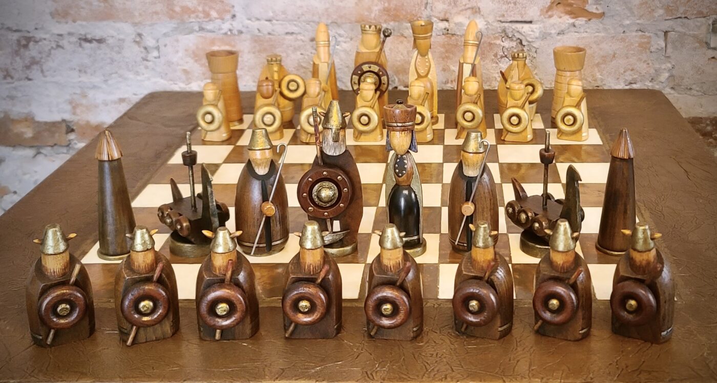
Chess Set
THE REBIRTH OF THE IRISH HIGH-KING, BRIAN BORU
DUBLIN: Old Norse; Dyflin, from the Gaelic An Linne Dhubh, adopted into Classical Irish as Dubhlinn; dubh, meaning ‘dark, black’, and linn, meaning ‘pool, pond’, referring to the murky tidal waters of medieval Dublin Bay, in the early eleventh-century, a Viking stronghold held by Sigtrygg Silkiskegg, the High-King of Dyflin and step-son of Brian Boru.
As ye may well have heard if you follow any of my social pages, the final installment of our ‘Manas Revival’ series has been put on hold until late March, as my plans for the February chessay took an unexpected, but delightful swerve due to an all-absorbing set of chessmen that landed on my lap over the holidays. The set’s existence came up at a Christmas dinner-party when the magical words, “Alan, would you be interested in an old chess set we have?” were casually uttered by our host. “It may have a few broken pieces as the kids [now teenagers] used them as toys when they were younger, but perhaps you could do something with them?” “I’ll take a quick peek,” said I…
Once the dust and cobwebs were dispensed with, I could see just why they were treated “like toys” as even I had trouble telling these little wooden warriors apart – let alone trying to play a game with them! So having enjoyed our sumptuous dinner, washed down with a few choice glasses of vino, I expressed interest, but reserved any decision, and the pieces were jumbled back into their dusty container for a proper examination in the studio the next day.
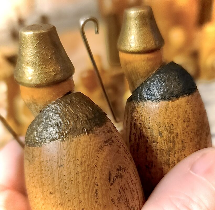
But even the following morning with ‘fresh eyes’ it still took some time to determine the light army from the dark, as the original colour scheme was a far cry from black and white – in fact, the two armies were pretty much monochromatic!
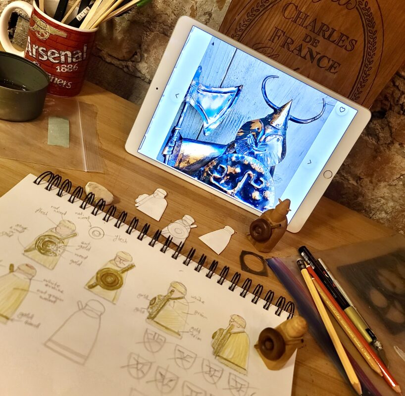
After much humming and hawing, however, I settled upon the array pictured here (pic above), which I believe to be correct, both from an artistic and historical perspective, which we’ll delve into in a jiffy.
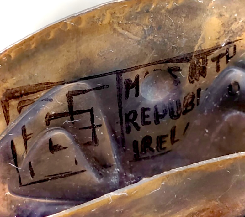
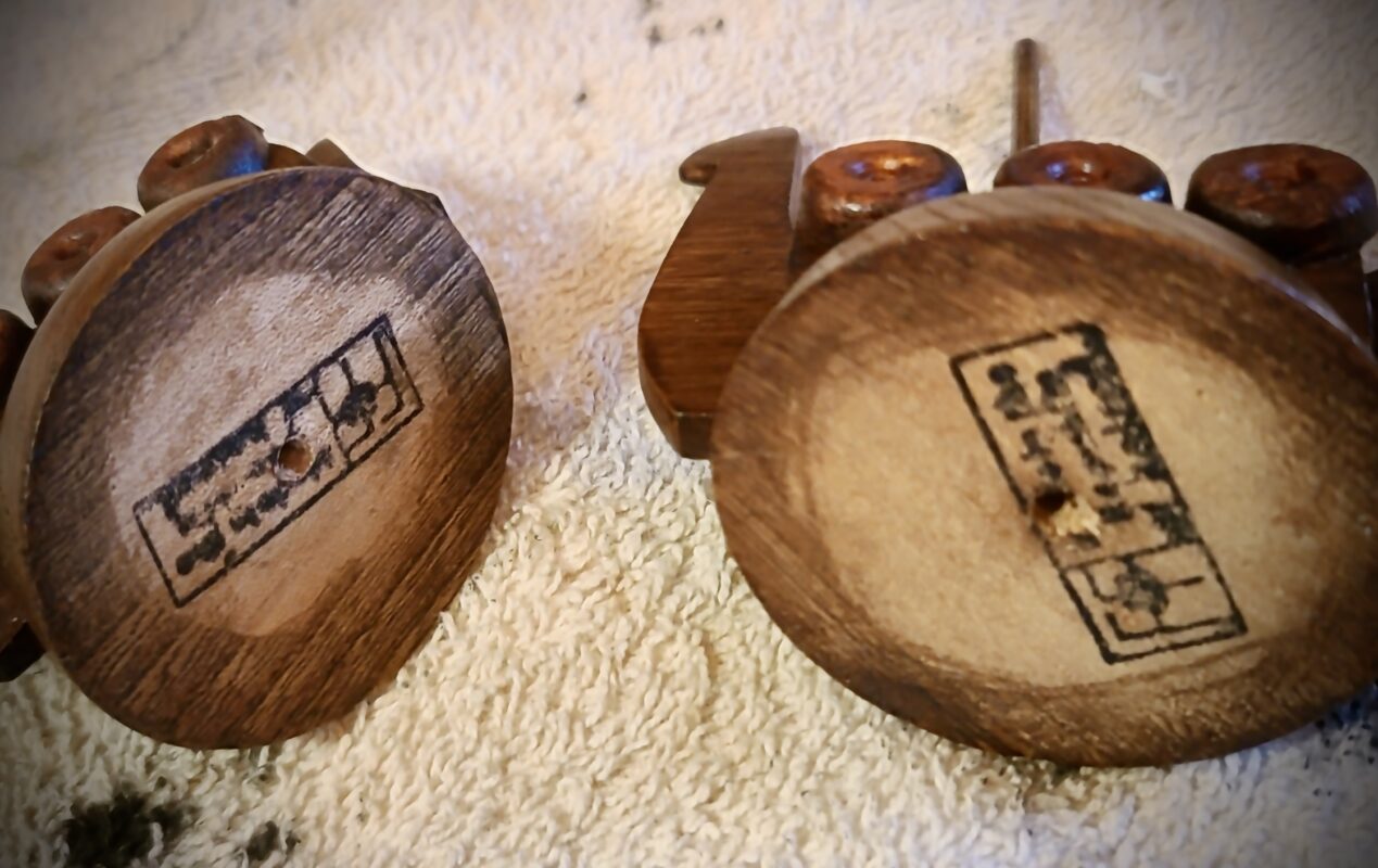
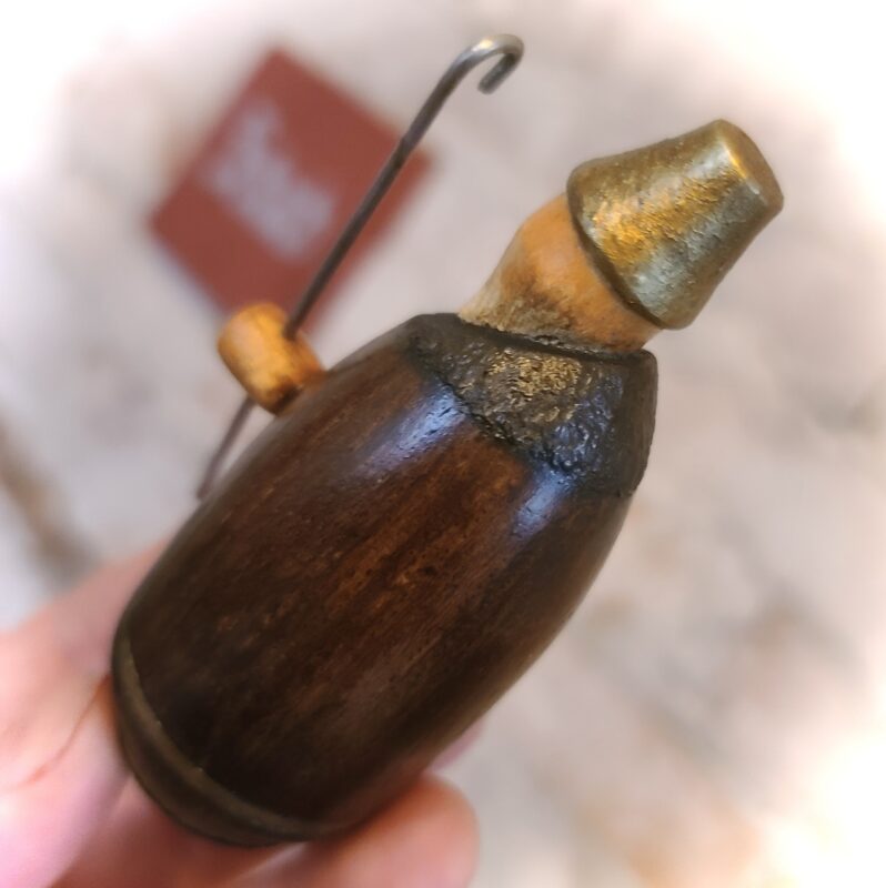
The project would be a challenging one in many respects – but my artistic embers had already been well and truly sparked and the gauntlet was eagerly picked up!On further enquiries, it came to light that the set was purchased in Dublin, Ireland, as a family gift during the 1980s, information that coincided with a blurry ink stamp on the bottom of each piece that read, “Made in the Republic of Ireland.” (pic right)
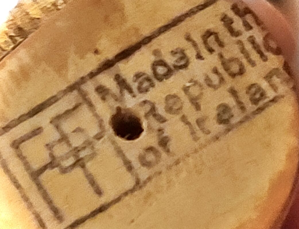
What caught my eye, however, was the interlocking ‘FF’ initials to the left, which l was vaguely familiar with, having already been introduced to an Irish sculptor by the name of O’Farrell via friends from southern Ireland (“y’mans just as off the wall as yeeself!” they said), and I was in little doubt the set was designed and manufactured at O’Farrell’s workshop in Dublin, which operated as a “furniture and retail business” from around 1955 until it ceased trading at the turn of the century.
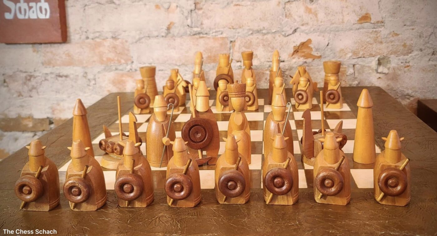
The self-taught, mixed-media artist, Fergus O’Farrell (1918-2008), began his career designing (other kinds of) sets and props for the film and theatre industries before setting up shop on South Anne Street, Dublin, crafting small pieces of furniture, wooden ornaments and small metal items inspired by traditional Celtic artifacts. In the early 1960s he travelled to Scandinavia fuelling his obsession for Norse/Gaelic history and especially the lucrative tourist paraphernalia that surrounded it. On his return he began sculpting miniature metalled effigies of Viking warlords and legendary Irish High-Kings, in particular, Briyen Boramha (c.944-1014), or in modern Irish, Brian Boru and his sidekick, the ill-tempered knight, Cu Chulainn, nicknamed ‘The Beast of Culaan.’ If you are unfamiliar with the murky history of the High-Kings of Ireland and Gaelic/Viking folklore in general, I suggest a visit to the Irish History Podcast episodes on The Rise of Brian Boru, suffice to say here, that the elderly Boru was killed during The Battle of Clontarf (23rd April, 1014) fought just outside of medieval Dubhlinn, waged against a Viking alliance led by his step-son, Sigtrygg ‘Silkbeard’ Silkiskegg. Given his obsession with Boru and Viking paraphernalia in general, I believe it is these two opposing armies and the legends that surround them that inspired O’Farrell’s chessmen – and the artist himself left us plenty of clues to back up this theory.
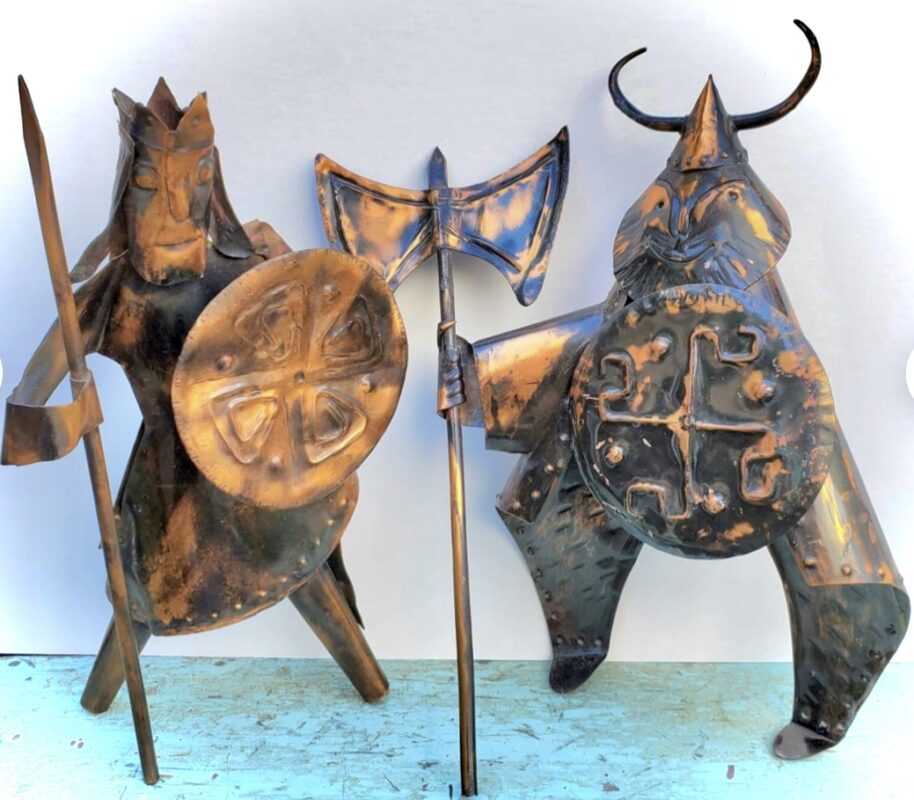
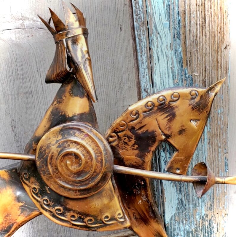
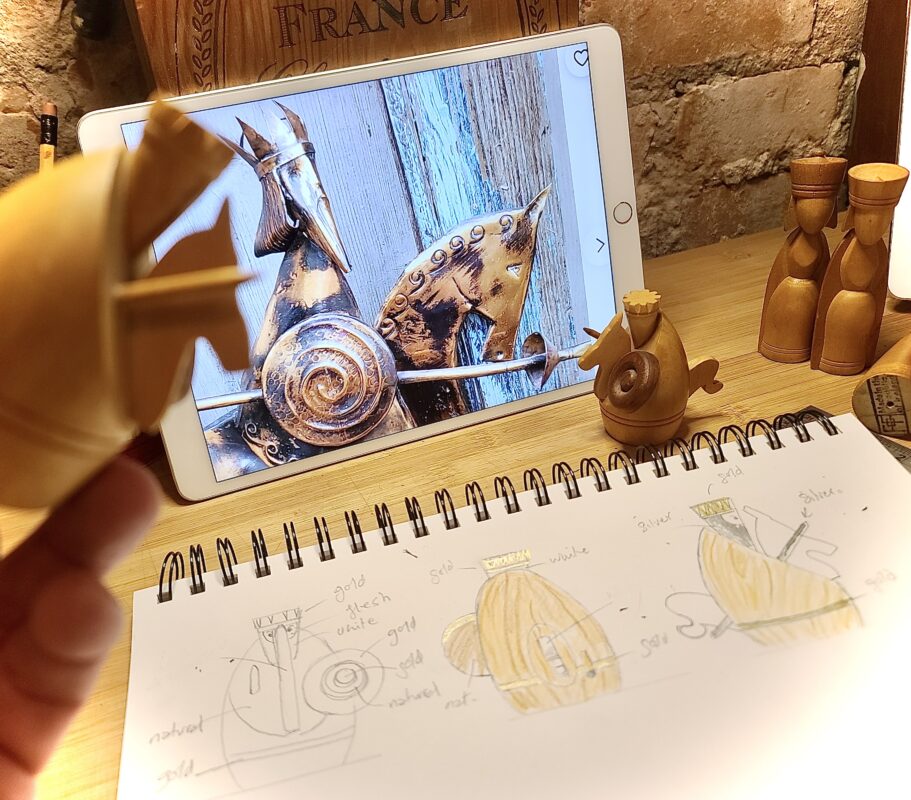
Transforming this thoroughly unplayable work of art into a functional figural chess set would account for my January, as numerous issues had to be addressed, the most immediate being the aforementioned monochromatic colour choice for the two armies. In my mind’s eye, I could already see each side highlighted with iridescent metallics; the light side with antiqued gold and the opposition with aged bronze, unashamedly inspired by three small metal sculptures credited to O’Farrell that bear an unmistakable resemblance to their small wooden counterparts (pics above). They portray a “High King,” a “Viking” and a “Knight” – in my opinion, the High-King, Boru, the axe-wielding Viking (Silkbeard) and a knight on horseback (Cu Chulainn), but only Boru carries the unique O’Farrell ink stamp on the reverse of his shield (pic below). As you may have guessed, my assumption that the set was based on the Battle of Clontarf is due to these three sculptures, which are dated to the late 1960s, shortly after O’Farrell returned from his travels.
Identifying the main characters of the set and the date of the battle made my task all the easier, as I was able to borrow elements from these original O’Farrell designs combined with historical accounts of the battle (attire, weaponry, etc.) and incorporate them into the chess set. A traditional, medieval ‘boss’ was added to the two shields of the kings, and like the Boru sculpture, an implied Gaelic cross, separated with four studs served as my inspiration for the white king’s shield. The black king, Silkbeard, also gained a nose-guard and tiny bronze studs to his helmet, mirrored by six larger studs surrounding the heavy boss of his shield, representative of the six-fold Viking Alliance at Clontarf. The white king, Boru, carried only a long staff in the original, which I transformed into a more formidable medieval weapon, a ‘morning star,’ to counter the mighty axe lying at the feet of Silkbeard. The morning star is held high in victory, Silkbeard’s axe lowered in defeat. These are minor improvements, granted, but ones that lend the set far more character as a whole.
Before the decorative painting and staining process could commence, however, there were other ‘technical’ improvements to be tackled. We cannot know, but I strongly doubt O’Farrell ever played a game with the set he designed. If he had done so, he would have noticed that certain pieces were far lighter than others, and that the two slender queens and tall white bishops were slightly unstable – a serious issue that called for a drastic solution! It wasn’t an easy decision to make, as it would alter the original aesthetics of the set, but I knew the remedy was to add weight and bases to these slender pieces. Of course, also for aesthetic reasons, this would mean that bases, for the sake of harmony, must be added to the rest of the minor pieces too, adding several more hours to the project.
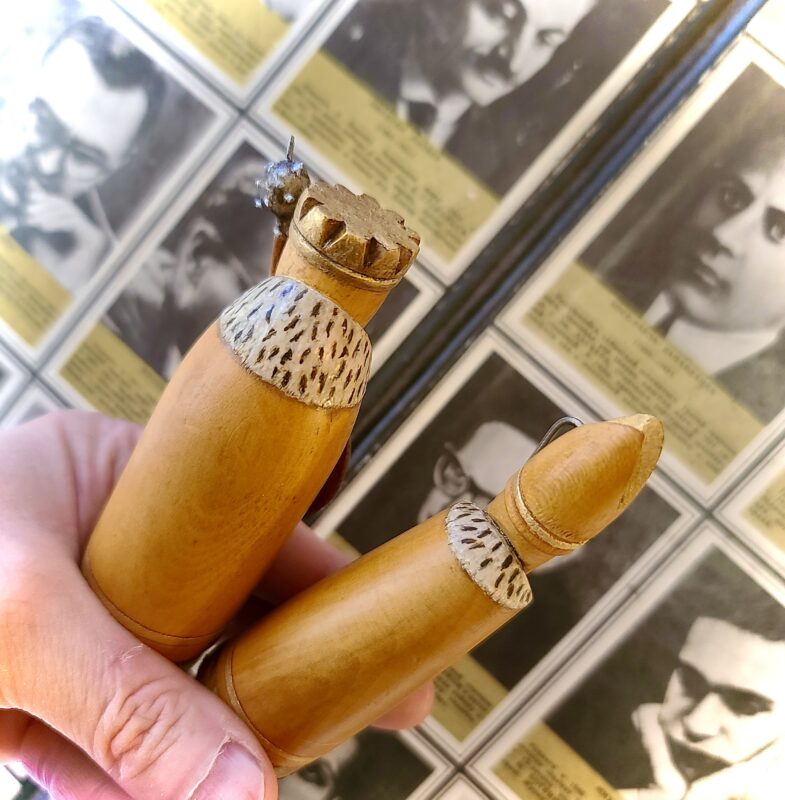
On the bright side, it would allow me to address some other niggling issues I had with certain pieces, like the oversized bases of the Viking ‘longboat’ knights, for example (pic left). These two fellows had a whopping base-width of 53mm, just north of 2 inches, creating an unbalance regarding an appropriate square size for the set – as they were almost double the width of the white pawns!
This very necessary improvement would mean carefully prying off the original bases and replacing them with smaller 35mm ones, more in tune with the width of the neighbouring black bishops – a sacrifice I was willing to make in the name of playability – and with hindsight it was most definitely the right call.
While O’Farrell’s imaginative Viking ‘longboats’ (or Knightriders, as I call them) had my full attention, I decided to add a miniature crow’s nest to their masts providing a much-needed focal point for grasping during the course of a game – another minor innovation, but one that fills my eyeballs and heart with joy every time I handle the pieces! Moreover, before attaching suitably sized bases to the white clerics and two queens, weight was added, and while I was at it, the slender black rooks and white pawns were weighted too, bringing them more in line with their heftier brethren, making for a well-balanced chess set all round.
This process of adding bases to slender or unstable sets is not uncommon amongst restorers, and here I’ll share a fairly straightforward solution to the problem should you need to add or replace the base-part of a piece for any reason.
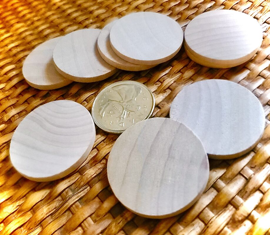
A quick-and-easy method for the handy Schachers amongst you (which doesn’t involve a lathe) is to purchase some inexpensive, pre-cut wooden discs online.These can easily be found in varying widths, depths and species of wood (pic right) and here I’ll quickly run through the equipment needed for replacing a badly damaged, unsalvageable base.
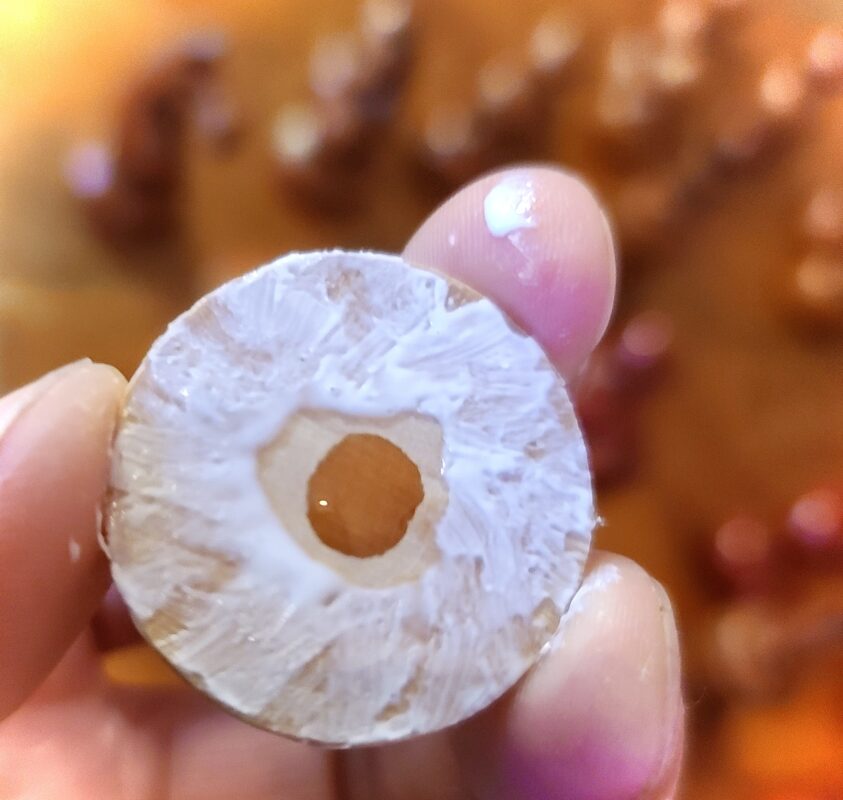
Once you’ve selected the appropriately sized bases for your chess set, sand down both surfaces evenly to ensure a clean attachment. To initially fasten the disc to the base of the chess piece I use two types of glue (why not, indeed?).My go-to is Weld-Bond, a clear-drying, universal adhesive accompanied by a small drop of your favourite super-glue, which is dropped into the dead-centre of the disc like so (pic left).
You’ll have a few seconds to make sure the base is properly placed, then press and hold the two parts firmly in place for as long as you have the grip and patience for. Clean up any excess adhesive with a damp rag (only the water-based glue will seep from the outside) and leave to set-up overnight.
The next stage, which I’d highly recommend (even though the bases will seem very secure) is to insert a few wooden support-pegs that run through the disc into the piece itself. For this simple operation you just need a Dremel, a 1mm drill bit and a few easy-to-come-by cocktail sticks (with the sharp ends removed), which provide ample enough support. I usually bore two or three cavities, tilting the drill-bit inward at an angle around the perimeter (the angle providing additional strength and avoids hitting my added weight), coat the pegs in wood glue and insert (pic below).
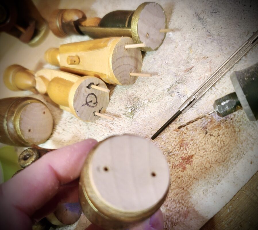
They should fit pretty snug with a few taps on a solid surface and the protruding ends can then be snipped off and sanded down to a level finish. And Bob’s your uncle, job jobbed! It goes without saying, mind you, that any detail/sanding work you wish to do on these bases should be done beforehand, eliminating the risk of clipping the original finish on your chess pieces. Anyway, these are just a few pointers should you need to add or replace bases. And, of course, if no weight is present you can simply glue and screw! It’s up to you…
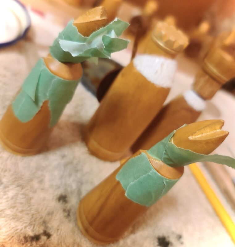
Returning to the project in hand; having sized and attached the bases and added weight where necessary, I turned my attention to the endgame – or what I envisioned the artistically reimagined set to look like over the board. Like most of my figural projects, I begin the process by sketching out each piece individually from all angles (pics below). Notice here the similarities between the metal and the wooden depictions of the knight, Cu Chulainn.
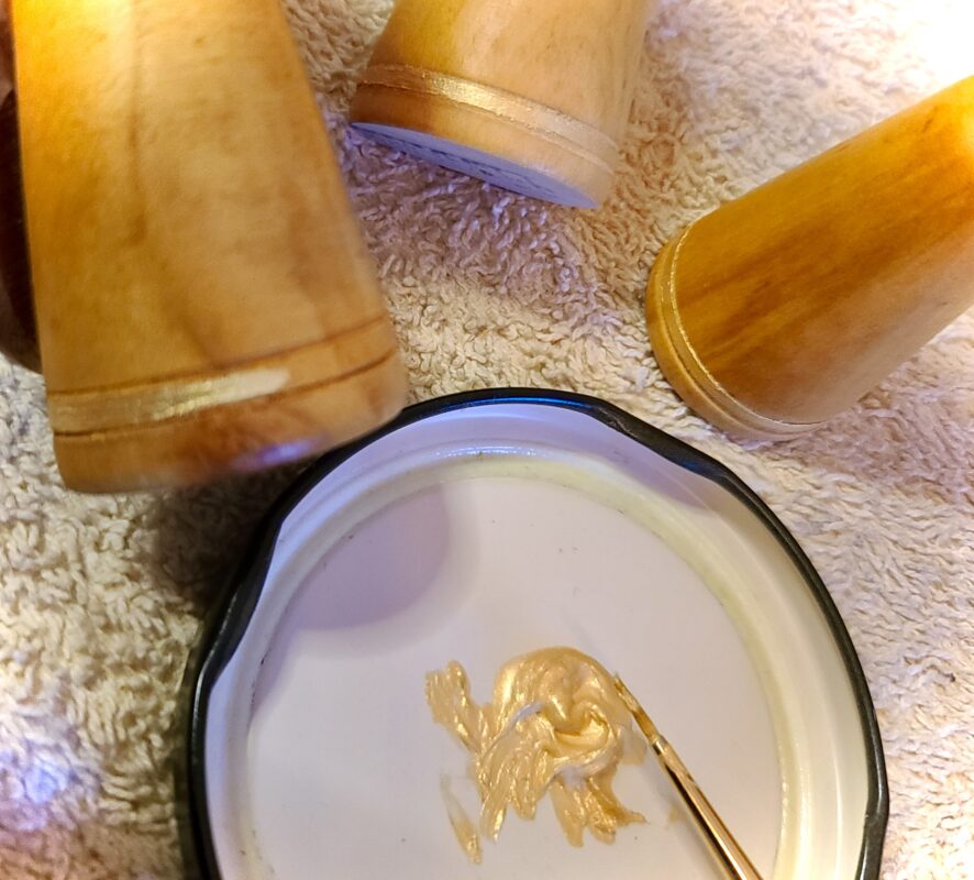
This enables me to play around with colour/palette ideas and get a general feel for the pieces and the artist who created them. O’Farrell’s set is made up of various hand-cut components, for example, the two queens (detail, right) are formed from six different components; gown, body, head, hair, crown and finial. To which I added a seventh, a base. And like the base, each component is glued and pegged into place forming a whole. Two channels were cut horizontally towards the base of each piece forming a band (with the exception of the rooks and longboats), which mirror the crowns and mitres of the white pieces and the crown of the black queen. These bands would be highlighted in antiqued metallic paint, providing me with a starting point for the decorative finish.
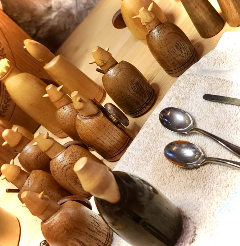
The most urgent issue that needed addressing was to deepen the colour of the dark pieces, the Viking army. I wanted to keep the integrity of the set intact, which meant keeping as much of the original maple-wood grain as possible. Therefore, a dark stain was the eye-wateringly obvious solution. I would start by colour-matching the pieces to the shields, then darken the set gradually to taste (pic below).
I did want to introduce a solid black colour, but sparingly, so this I reserved for the black queen’s attire and the lining of the bishops’ robe. This would provide a contrast with the heathen bishop’s white beard, hinting at a medieval dog-collar and the Vikings eventual conversion to Christianity via the fifth century teachings of Saint Patrick, no doubt the inspiration for the white bishops.
In the Old Norse dialect of the eleventh century, these fur-clad Viking “shamans” were called berserkirs (lit. ‘bear-shirts’), inadvertently solving yet another problem I encountered with the pieces. From the rear the black bishops and pawns looked very similar, leading to problems over the board. To remedy this I decided to cloak the berserkers’ shoulders with bear fur, an idea that would be carried through to the king. As you see here below, the faux fur is raised and textured and of a different sheen to the darkened wood, clearly distinguishing the minor piece from the pawns. Another problem bites the dust.
Again, for the sake of consistency (and a little eye-candy), this idea was carried over to the white clerics and royals too, but instead of bear-hide they would be cloaked in the white winter fur of the ermine. Here I used the same layering technique using thick enamel to begin with, which is then textured with metallic paint, flecked and aged with acrylics, all sealed within a varnish topcoat (pics below). This is a prime example of the malleable artistic process. Without the black bishop/pawn issue I’m not sure whether the idea of ermine (adding a welcome splash of white to the light pieces) would have occurred to me. Ofttimes, you just have to go with the flow…
The most difficult pieces to assign to the rightful army were the queens. The originals were almost identical in form and colour – making for a most discombobulating endgame! Only the lack of a ball finial (on the now-white queen) and the angle of their crowns differentiated the two – quite honestly, I don’t know what O’Farrell was thinking here!? The new toilet of the queens and the shield design of each king were the most rewarding part of this project. These two elements really made the set sing (or ‘chant’ as they would have done in those days). The shields were decorated with textured metallics first, using O’Farrell’s sculptures for inspiration. The same ‘stud’ motif was then carried over onto the queens in the form of a circular necklace, tidily tying the two royals together in a visual, as well as matrimonial harmony. A deep-brown stain washed over with a thin black glaze was employed to make the necklace pop on the dark queen, this effect was carried down onto her long dress, or kirtle, all bordered with a backdrop of pure, unadulterated gold and bronze, inspired by the illuminous gilt leaves of medieval manuscripts. And, of course, I couldn’t resist using this same gilt effect on the ecclesiastic, Saint Patrick, too! (pics below)


[A brief historical note on the queens: Well before the battle of Clontarf, Boru was married to Gormflaith, the daughter of the King of Leister, who was Silkbeard’s natural mother. At the time of Clontarf, Silkbeard was married to an unnamed daughter of Boru (from another marriage). At some point, Silkbeard was also married to a daughter of Boru’s brother, Wolfe the Quarrelsome. Evidently, both Boru and Silkbeard took many young wives, so name your own queens, basically!]
Unique to this set, and with a respectful nod to the original designer, I’ve added the distinct O’Farrell signatures to the base of the queens which accompany our own unique signature. There are many other subtleties for your eyes to discover on virtually every piece, but I’ll let your pupils do the wandering. One that deserves mention (as it is very subtle indeed) is the use of antiqued iridescent pearl on the shield bosses of the white knights and pawns. This is carried over onto the inner crown and ball finial of the queen, reflecting the new, iridescent pearl, hand-painted ‘Power’ signatures found on the bottom of both kings – symbolic of the Chess Schach projects completed throughout 2023, which I plan to make our most exciting year thus far!
In parting I’ll leave you with a few photographs of the finished project (below). I hope you have enjoyed this brief insight into the process of transforming a thoroughly unplayable set into one that is now an absolute delight to manoeuvre around the imaginary battlefield of Old Dyflin. I must admit, my heart dipped when this project was completed, as I thoroughly enjoyed every step involved in the reinvention of these characterful Celtic pieces. And on a personal note, it’s a great shame that the original artist, Fergus O’Farrell, isn’t with us today, as I would have absolutely loved for him to clap eyes on his creation in its ‘reborn’ and respectfully reimagined form. Lord only knows what O’Farrell would have thought! But I somehow feel that he is smiling down on my thoughtful tinkerings from on high – or was that an almighty clap of thunder I heard from above? “Ah, be gone wit’cha tinkin’ loik dat! Tis a round of applause, ye tit!” Well, thank you kindly, Fergus. It was indeed an almighty Craic!


I’ll be hanging on to these Old Irish warriors for a while, as I’m not quite ready to part with them as yet. When the time feels right to let them loose in the world you’ll be the first to know. But for the time being, I have a vintage bottle of Powers Irish whiskey 🥃 and the great gambit-games of the Irishman, George MacDonnell (1830-1899) to explore – what a grand combination – this may very well take some time…
Until next month. Check you later!


All rights reserved, Alan W. Power, The Chess Schach. February 2023.
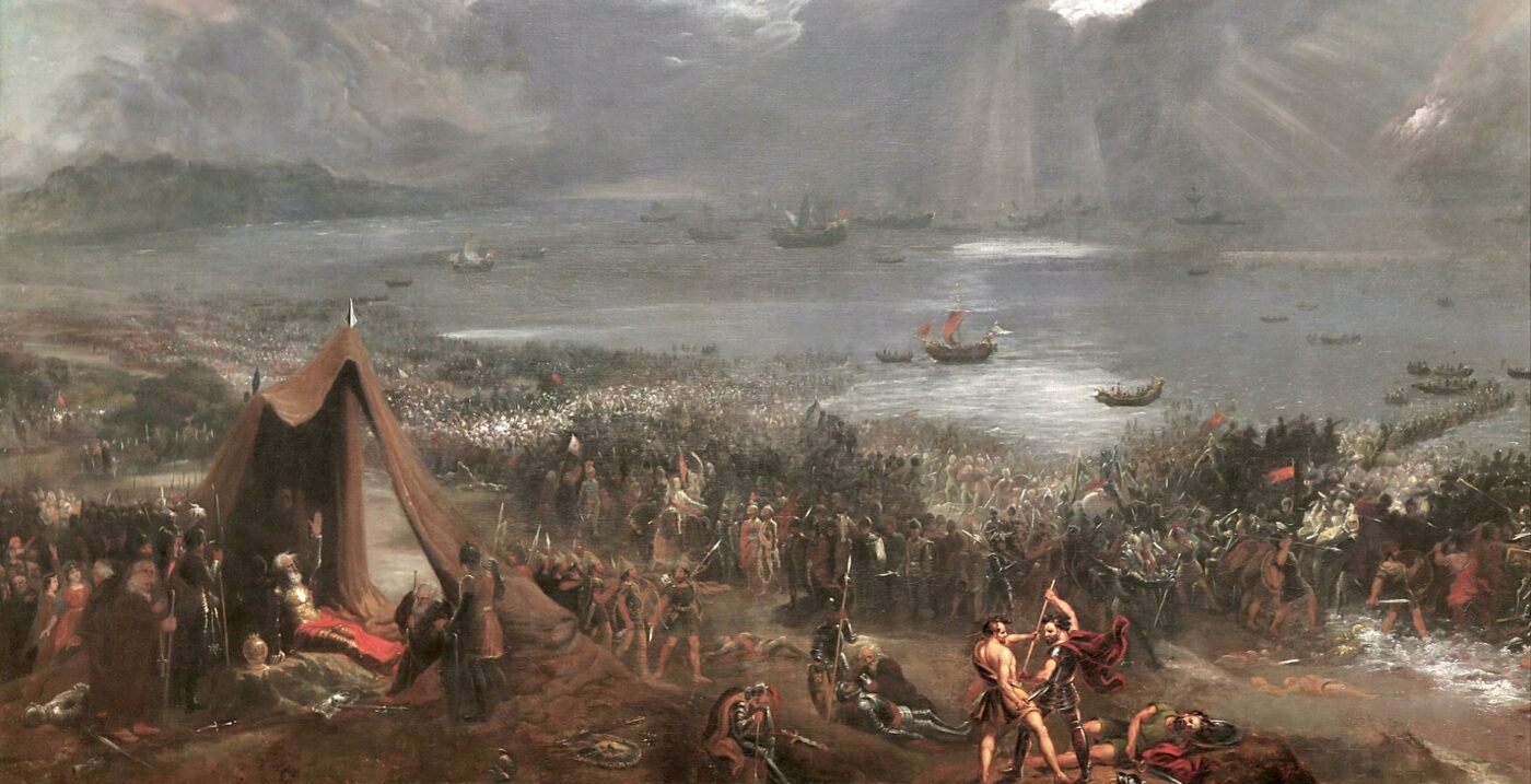
Header: The Battle of Clontarf, oil on canvas, Hugh Frazer, 1826. public domain.
Photo credits: The Chess Schach
Pics 3,4&5: Archives of Etsy store; LushVintageDecor (pics from August 2022)
Last photo: Chess Schach; Label from the underside of an O’Farrell chessboard. Photo source: Patrick Power